
It’s been a long time since I did an Art Round-up. Over the last few years I seem to only do one at the end of the year. Over the last year, due to the rise of AI and my lack of success as a freelance artist/graphic designer, I largely focused on writing new instalments in my Strike Agent Chronicles book series instead of spending time creating new art which contributed to doing yearly round-ups.
Perhaps it’s down to a small burst of creativity or that I feel like taking a break from writing (after completing drafts of 3 soon to be released novels in my book series). Either way I’ve been busy these last few months creating some new art.
Dance la Esmerelda
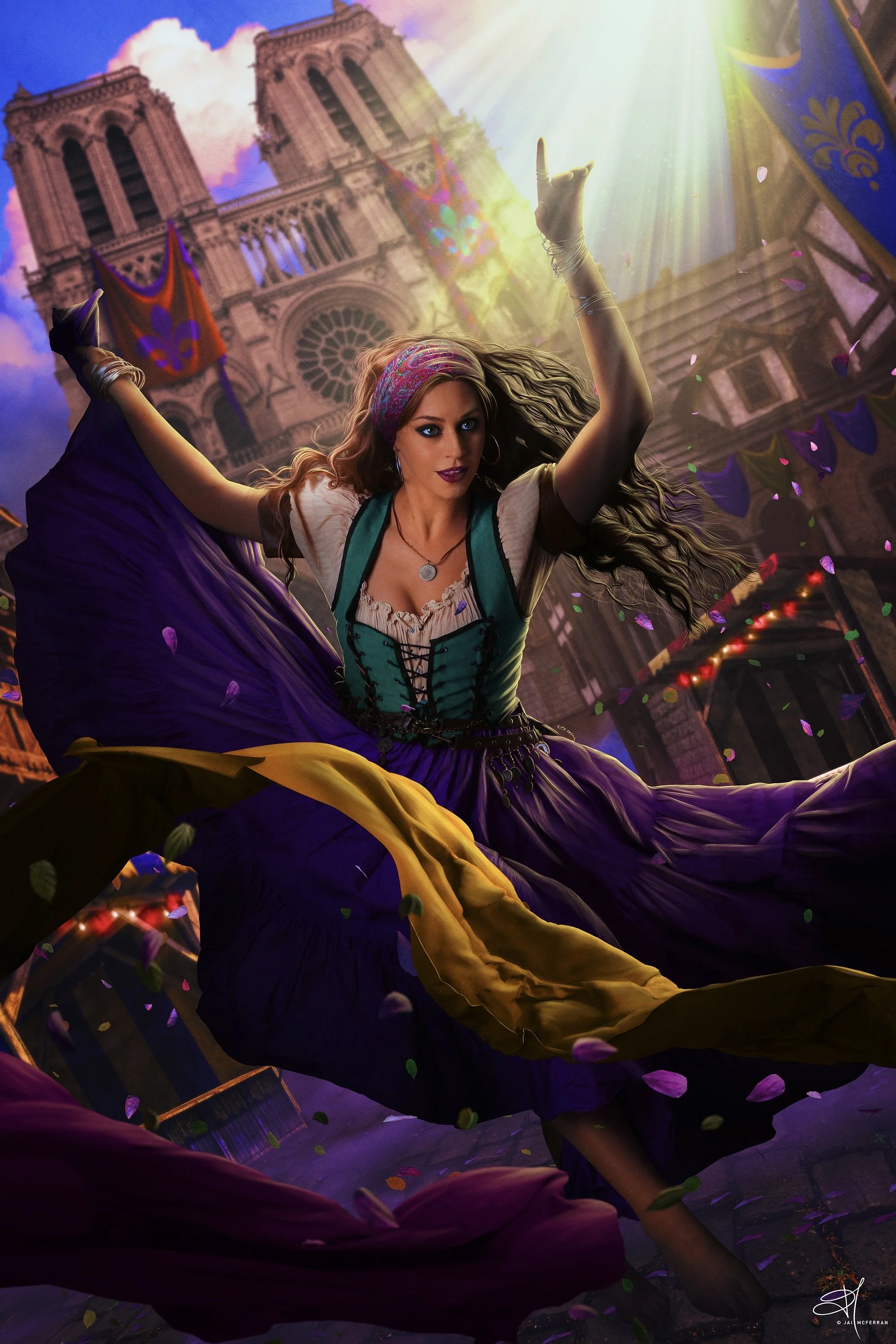
Dance la Esmerelda, 28/01/24
Recently I re-watched Disney’s Hunchback of Notre Dame, a film I’d only watched once in the cinema upon its release when I was 7. I forgot how great the story and music was, but also how much I love the animation. So much so it inspired me to create a piece inspired by the movie.
I knew I wanted the image to focus on Esmerelda during the Festival of Fools, I wanted to showcase all the streamers, banners, and confetti of the celebration, I thought it would add a dynamism to the piece which could be quite interesting. I also approached the image as if I was creating a character poster for a live-action remake of the movie (which Disney loves to do nowadays).
While I like how this image turned out, I can see some issues with it and things I would change if I were to re-do the image. But overall it’s not bad for my first piece of art in nearly a year.
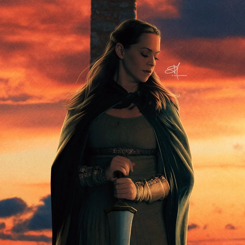
God Help the Outcasts

God Help the Outcasts, 18/02/24
For my second piece of the year I decided to revisit Disney’s Hunchback of Notre Dame once more, to see if I could redeem myself with an image from the same universe which I liked more than Dance la Esmerelda. I wanted to incorporate Quasimodo’s home of the cathedral’s bell tower, but also wanted to keep the focus of Esmerelda.
For the bell tower I had to create the scene from scratch as it’s surprisingly hard to find stock images of bell towers and attic-like locations in churches. I also wanted to include the famous rose window even though I know, anatomically, this window wouldn’t appear in the bell tower. I love working with stained glass, I love the opportunities it presents for colour and light within an image so wanted to include it, even if I sacrificed architectural accuracy. It’s a perfect companion for Esmerelda in this image.
Around this time I also wanted to start experimenting with Technicolor finishes on my images. I love old Technicolor movies and the vibrancy of colours they produce. I wanted to recreate that feeling here. I wanted my art to almost look like a still from an old Technicolor film from the 40s or 50s.
I enjoyed creating this image and think out of the two Notre Dame images, this is the more successful one. I like how the colours turned out and I always enjoy when I get to play around with light.

Against All Flags & The Golden Vanity
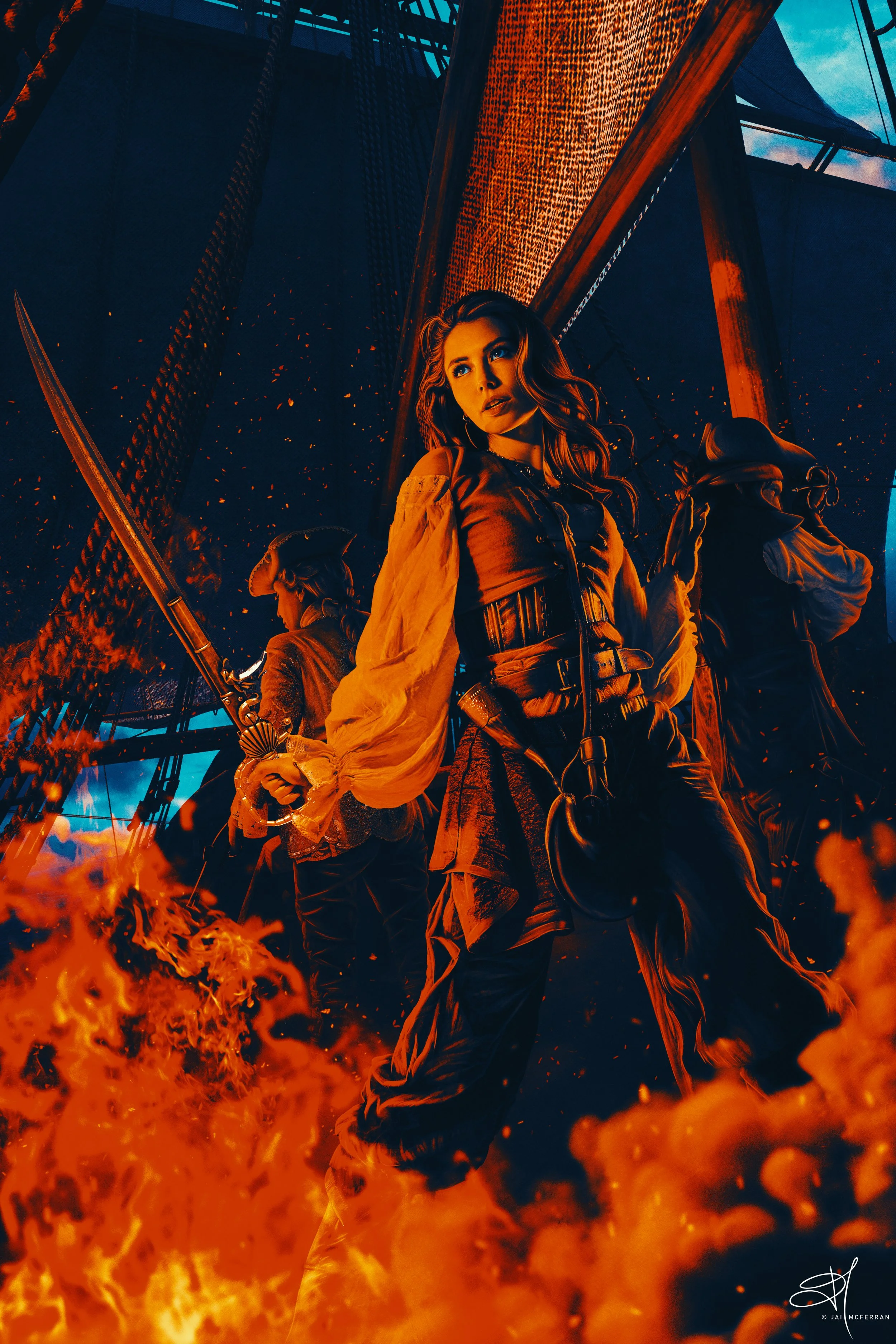
Against All Flags, 03/03/24
Continuing my fascination with Technicolor and films from Hollywood’s Golden Age, I wanted to make a piece of art reflecting my love of classic swashbucklers like The Black Swan, At Sword’s Point, and The Master of Ballantrae. My favourite film of the genre is this piece of art’s namesake, 1952’s Against All Flags starring Maureen O’Hara and Errol Flynn. The film is set in 18th century Madagascar and tells the story of British officer Brian Hawke (Flynn) who must infiltrate the pirate Republic. While on mission, Hawke meets and becomes infatuated with pirate captain Prudence ‘Spitfire’ Stevens (O’Hara) and the swashbuckling ensues.
I’d always wanted to create a piece of art which pays tribute to this movie, and all like it, but pirate stock is quite difficult to come by. I had some images I thought would work for this piece and sure enough I was able to produce not just one swashbuckling piece, but two.
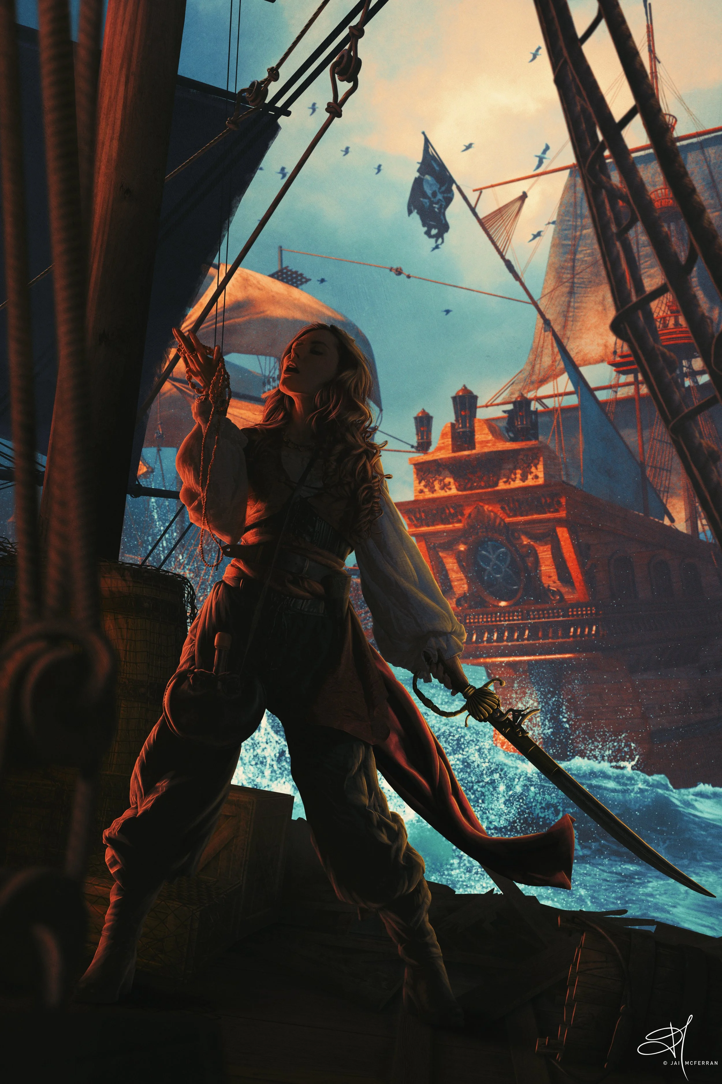
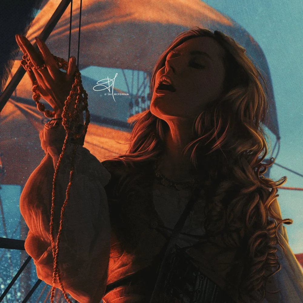
The Golden Vanity, 11/03/24
Out of the two pirate-themed images I created, The Golden Vanity is by far my favourite, I’d go even further to say it’s my favourite piece of 2024 so far, and my favourite that I’ve created in a long time.
In my opinion it perfectly captures the swashbuckling atmosphere of Golden Age pirate films, but also, and just as important, it perfectly reproduces the vibrant colours created through Technicolor. I love the background with the ships and waves, the colours came out really well. I just love everything about this artwork and it’s something I want to try and do more of.
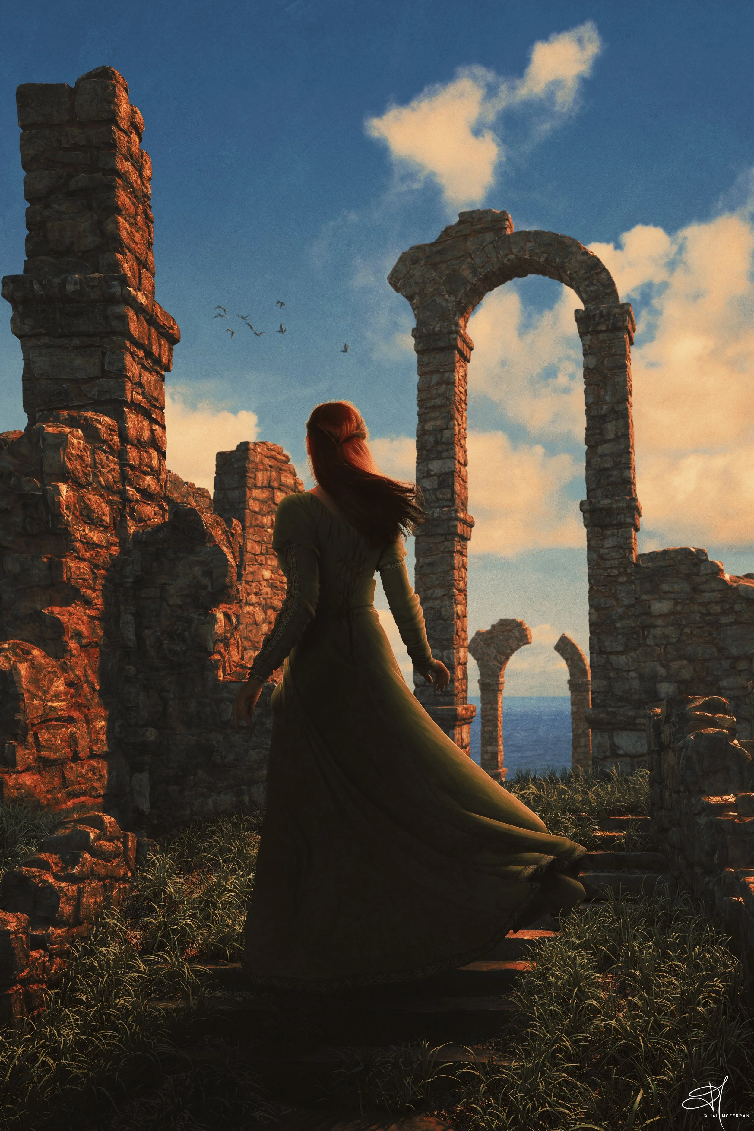
Tales of Ceinn Bán & Journey’s End

Tales of Ceinn Bán, 14/03/24
I seem to be creating art work in pairs this year. It wasn’t really a conscious decision, at least not at the start. With the Notre Dame pieces it was born from me not being happy with the first piece, and wanting to better it. With the swashbuckler art, while I like Against All Flags, I wanted to create a pirate piece that incorporated the scope of a swashbuckler movie, I wanted it to be epic in scale, which is where The Golden Vanity came in. With these next two images I decided at the onset to create two pieces of art which were related to each other. I wanted one that took place at sunset and another that took place during the day.
I had stock images of ruins that I thought looked suitably Irish and knew I wanted to create images of grassy ruins set on hills or cliffs surrounded by the ocean. I also love the green dress and cloak the stock model wears, and thought it would fit perfectly in this setting, and as I had so many images from this set I thought why not use them?
Again, I wanted to give these images a Technicolor feel and I think they turned out really well. I love the colours and think all the different elements blended together perfectly. Grass is always a bit of a nightmare to work with because it’s so detailed and pernickety, but the foreground grass blended quite well with the ruins to create a seamless location.
Journey’s End, 16/03/24
It’s rare for me to create images set during the day. I much prefer to have images where the light source is much more defined (such as a sunset, moonlight, a lantern, fire etc.) using daylight sun as the light source definitely takes me out of my comfort zone. So for the daytime image, Journey’s End, I did just that. While I don’t think I was completely successful, I still enjoy the colours of this image and it’s something I want to continue to experiment with.
I’m hoping to continue this 2-piece artwork strategy going forward. I think it’s a good challenge to try and create two pieces of art within the same “scene” and have each of them stand on their own but also complement each other. Over the rest of 2024 I’m hoping to create a total of 16 pieces (8 pairs) and I already have my next four images mapped out, for the most part.
Outside of my art I am hoping to start back writing my seventh novel in The Strike Agent Chronicles soon as well. I have one final re-read of the sixth instalment to complete before I can focus on the seventh, so I’m hoping to start writing the next book this spring.